


Grace Nugent: NSPA Designer of the Year portfolio
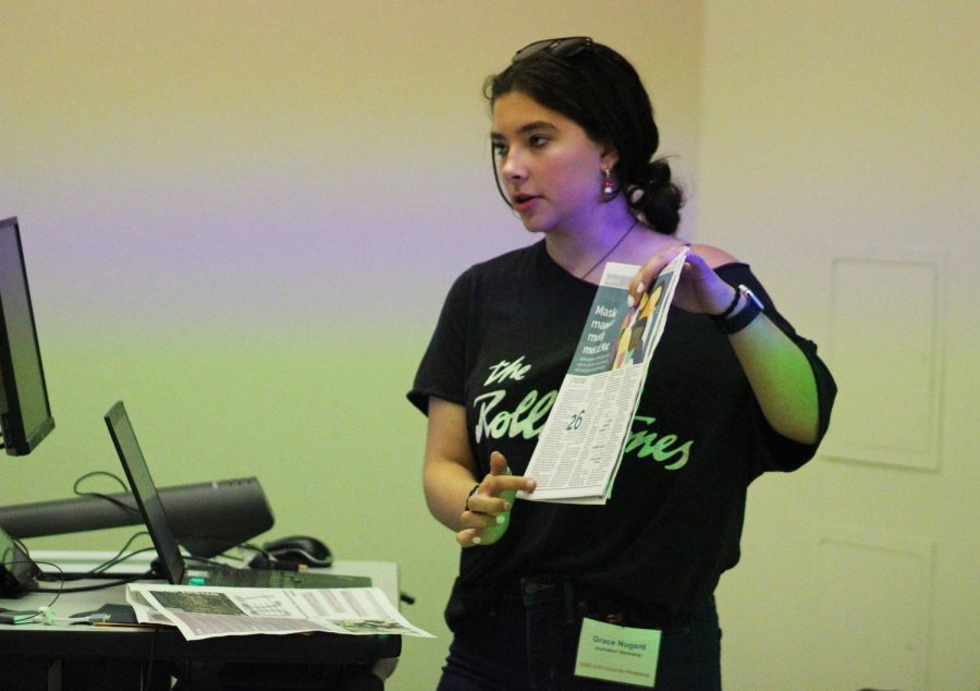
Former Shield co-editor in chief Grace Nugent teaches modular design to first-year journalism students at the Journalism Boot Camp at the Interscholastic League Press Conference summer workshop held June 17-19 on the University of Texas campus.
My journalism adviser sometimes jokes that I am She-Hulk: that I will at some point turn green and triple in size. It sounds slightly off-putting and scary, but it’s just because I love and have a passion for my school’s publication, especially its design. If that love makes me the resident She-Hulk of The Shield, I will happily take that title.
Each of my years with MacJournalism has felt like a movie in a discordant saga. The first year: Almost Ambitions, a story fueled by competition and a new found love of journalism (much like Almost Famous, William and I found a home in asking questions). Second year: A Whole New World, like the Aladdin song except instead of a new world of exotic places it was a new world of folios, nut grafs and ledes. Third year: Nugent’s 11 but instead of a team robbing a casino, it’s a team desperately trying to meet deadlines. And finally my last year on staff is Top Gun: Shield where I, like Maverick, grew in my leadership abilities and responsibilities, deepened connections and led a team on a daring mission (the mission: coming back into the newsroom after a year and a half of online school).
This year I undertook a task that was a visual version of storming the barricades in Les Mis: a re-design of our print newspaper. Our publication, The Shield, had not undergone a redesign in about seven years and my fellow EICs and I thought that modernization was necessary. The process was somewhat rocky and filled with turbulence, but we were ultimately proud of the result. Because of my design work in the past, especially junior year, I took the redesign as a personal challenge and tried to spearhead the overhaul. There were specific pages, elements and processes that needed to be changed. Chief among those were fonts, gutter spacing, pull quotes and my arch nemesis: sports highlights.
After much deliberation the old Chaparral Pro, PT Sans and justified text were out while we ushered in Raleway, Neuton, a pull-quote makeover and interior spacing changes. Just imagine an ’80s makeover montage but with a lot more stress, uncertainty, caffeine and tacos and that was how the updated style guide for The Shield was born. With the redesign, we prioritized readability and modernization. My personal victory however came when I transformed our sports highlights page from a monstrosity of text where readers are left confused on where to start, to something more aesthetically pleasing with intentional white space and cohesive photos.
Design for me is not just putting and then rearranging elements on a page but rather painstakingly working and reworking each design until it is cohesive and invites the reader to enter the page and consume the content it offers. As the co-editor-in-chief with the most design experience, I became our de facto design point person, answering questions from each page designer, requesting revisions and polishing each page before it was sent to our adviser. If someone wanted to break design rules they were told to “ask Grace” first.
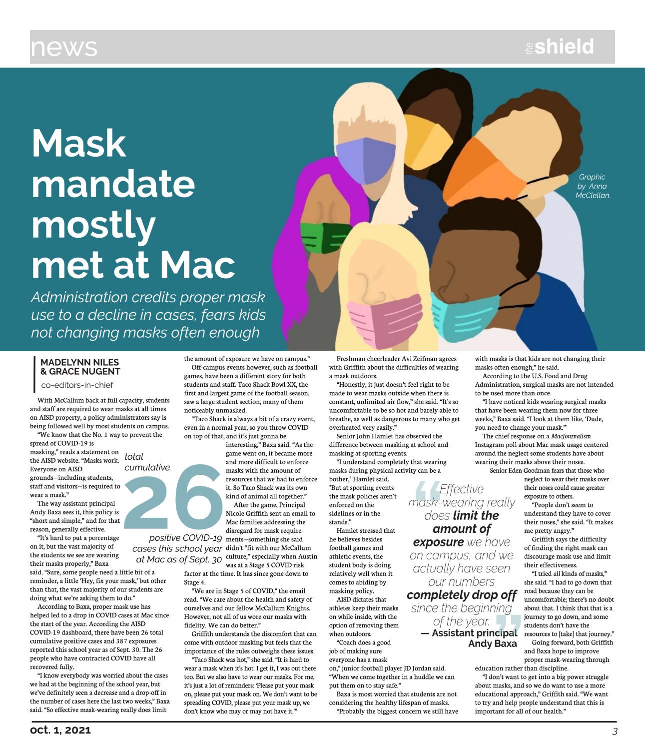
The first page in the redesigned paper was this page three news story in our first issue of the year. It was a double challenge because we were designing an actual page (and writing a breaking news story) as we were rethinking every element on the page. The page design itself may be nothing special, but because it was the launch of a whole new look for the paper and because my colleagues and I had spent a lot of time re-imagining the look of the paper, it was a big deal to me. While many of our readers may not have even noticed the different look from the previous year, for me, the page offered visual confirmation that the redesign was worth the stress it had created and that the long hours my fellow editors and I had invested in it were paying off.
We added new visual entry points, introduced a new font package (centered on the far more alluring headline font, Raleway) and debuted a revamped pull quote design that relied on the new font, italicized text, bolded key words and a splash of color for the quotation marks. Our external evaluators criticized our design from the previous year because they said that our sections were indistinct from each other visually. To address that criticism, we added a front-page design to open each section that incorporated a large bar across the top of the page and assigned each section its own spot color. For this page specifically, I added a recurring color by using it as background color for the graphic (original artwork by visuals editor Anna McClellan) as well as in the pull quote and the infographic.
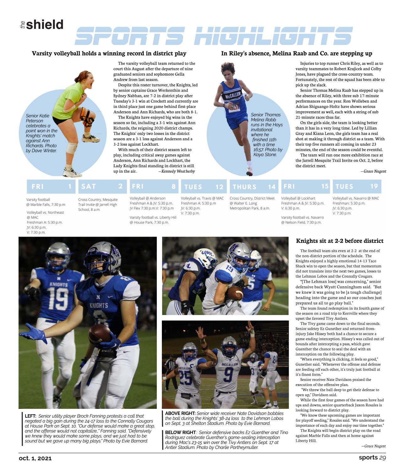
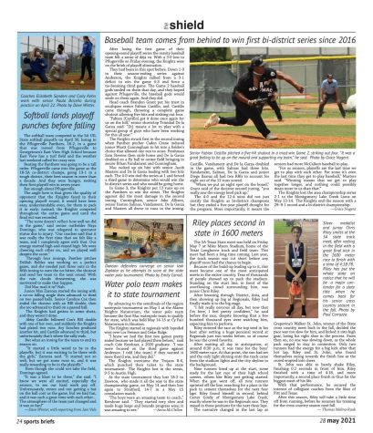
My real crusade began with the page that used to bring me visceral anger, a page that, even though I designed it for an entire year, I will critique at every chance I get (much to the chagrin of my adviser): the dreaded sports briefs. The previous fonts and text justification created no entry points for the reader, and the sheer amount of text on the page was more likely to cause an eye spasm than a read brief. We started the redesign by switching from justified text to flush left, which is much more accessible to readers and creates helpful and necessary white space. The bottom of each highlights page is a photo collage anchored with a dominant photo and smaller rectangular secondary photos along with a story much shorter than we would have written on the page the year before. For the first issue the lead sports brief was our school’s first football victory over our top rival in three years followed by two disappointing losses to lesser foes. Above the lead story, I added a new graphic and content element—a calendar—and above that secondary sports stories, each with a featured cutout from other in-season sports. The use of blue circles (blue being the assigned sports section color) enabled the athletes in the top stories to pop out and break through the circle while still adding a complementary color and shape that differs from the rectangles and squares at the bottom . This page is my baby. It makes me simultaneously angry and satisfied when the sports brief page is completed. My anger with this particular page was softened when I won a Best in Show for this design in the Sports Package category in the 2022 Southern Interscholastic Press Association Visual Contest (a personal highlight).
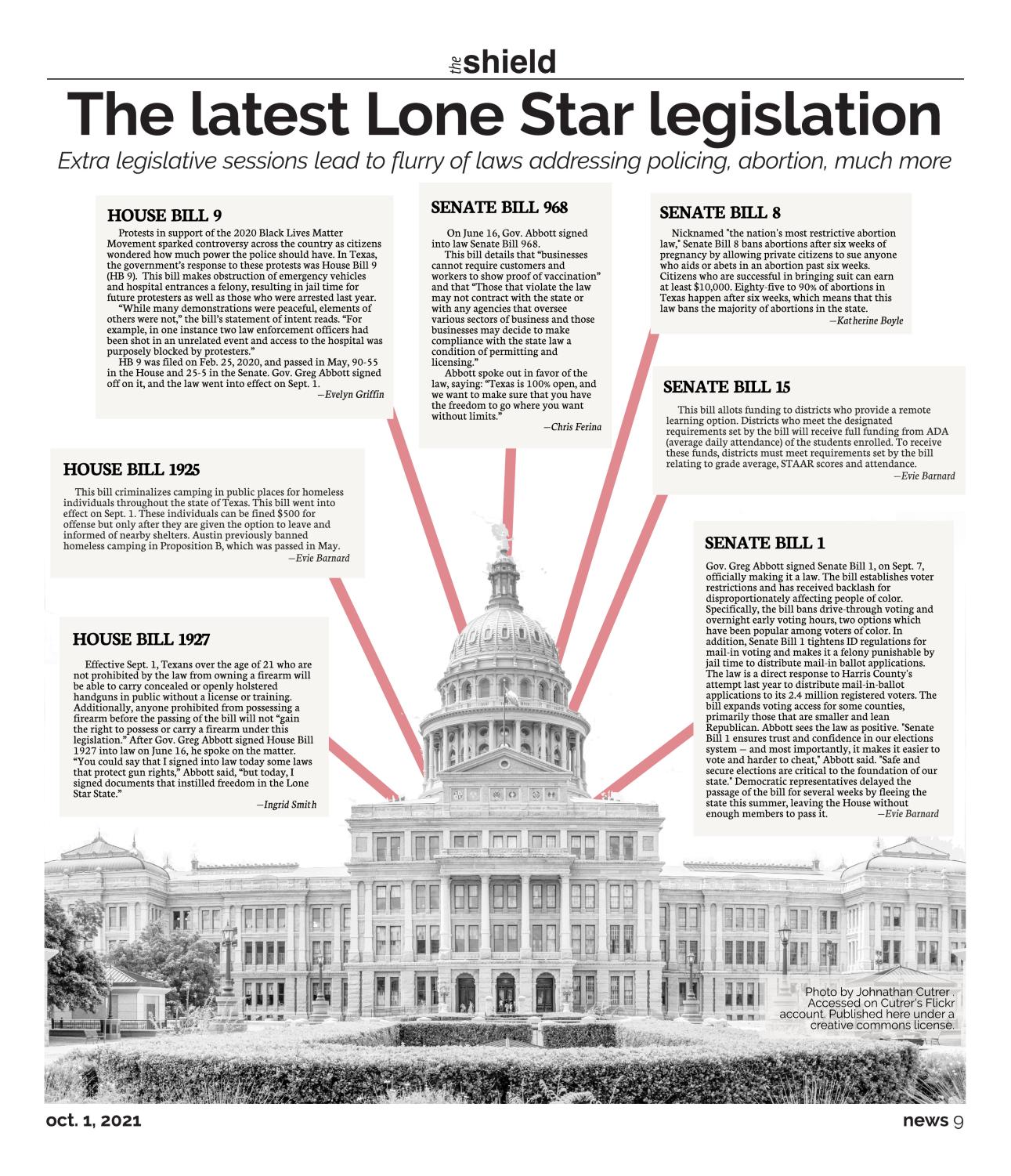
The latest Lone Star legislation
This traditionally is a news briefs page, similar to sports briefs before the redesign. Like its sports counterpart, the page was a design challenge that we always struggled to solve simply because we were trying to cram too much text on the page. To improve the design this year, we did away with the hodgepodge of random “news in a flash” stories and instead went with a package of connected stories that gave the page a specific angle. Because there are many politically active students on our campus and because the Texas legislature was pushing forward some controversial bills that had clear consequences for our community, I connected with our news editor Evie Barnard to find an accessible way to deliver super *fun* legislative information. I decided to present each bill in a rectangular text box and connected each to a dominant cutout of the Texas Capitol (a familiar image to most of our readers) thus balancing out and offsetting the monotony and orthodox shape of the bill briefs. I chose a grayscale for the image because I wanted a singular color (the thick red rule line) to pop. The grey-beige palette also complements the left facing page next to it as they both have minimal color. I am proud of this page, it is unlike any other in the newspaper, and it takes a new, easily digestible approach to presenting heavy legislative topics to our short-attention-span readers. It also earned the staff a Southern Interscholastic Press Association Visual Contest award.
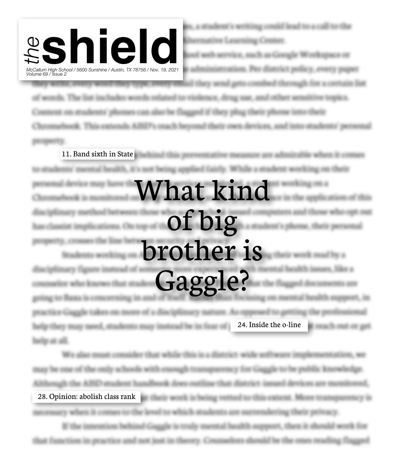
Cover: What kind of big brother is Gaggle?
This was a hotly debated cover between the editorial leadership. While very black-and-white and simplistic, it is a cover that is unique to McCallum. Resident contrarian and investigative reporter, co-editor-in-chief Alysa Spiro, crafted a news story about a district-mandated software surveillance service that motors student writing, pictures, etc… and flags content to be read based on key words that suggest that the student might need help or in some cases discipline. The article presented both the benefits, safety objective and concerns about violations of student privacy, and the board editorial for the issue also took a stand on the topic. Our coverage equated the service, named Gaggle, to “big brother” from George Orwell’s 1984. For the cover, therefore, I tried to do something that represented how students felt about the surveillance in an immediate and digestible way while also suggesting that “big brother” is watching over students’ writing. As some on our staff lamented, the cover isn’t colorful, but for a story about a policy that with a lot of grey areas, the lack of color conveyed the subject pretty well. I chose to un-blur specific words in order to tease other stories in the issue in the same way that specific words would be pulled out by the Gaggle software. The centered text on the cover was meant to pose a question that was answered in multiple ways throughout the issue. The topic merited being the cover story because we felt students’ deserved to know about this software and, unlike a lot of other schools, our administration was not only transparent about it but willing to let us report on it and criticize it freely.
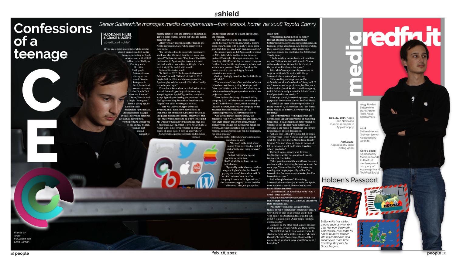
I close this portfolio with the design that I believe pushed my artistic and design horizons the most, one with enough reverse type to merit an email to the printer to make sure that the story would remain readable despite the amount of ink that would be used to print it. It was a risk worth taking in my view because this is the design that is the most visually appealing of any that I’ve done, and I think it also perfectly encapsulates the subject I was profiling (an 18 year old CEO named Holden Satterwhite). My inspiration for the page design was Steve Jobs meets The Harbinger, and this page delivered on that muse. For the dominant photo, I did a partial cutout layered on top of the original image in order to wrap the text around the subject’s face and computer, adorned with stickers, exemplifying his love for technology and Apple specifically (Holden was fortuitously even wearing an Apple sweatshirt).
I took some liberties and strayed away from my beloved style guide to do a headline that focused on him being an 18-year-old CEO with the “O” being the logo of one of his companies. The right side is a stark contrast of white, grey and red to juxatpose the dark black of the left side. The right module also has a very “I aspire to be the next Steve Jobs” style cutout of Holden next to a timeline of his adventures as a teenage CEO. I included these elements because while there is a lot of text on the page, I still wanted to have entry points for the reader and graphics that would visually represent Holden’s life and loves. That is why at the bottom of the page there is “Holden’s Passport,” something that has nothing to do with tech but another passion (travel) of the multi-layered tech teenager. One of my first and one of my last graphic endeavors for The Shield were the little post cards on the bottom right that add more color (and connect to the colors on the computer stickers) and just show visually more of who Holden is. Overall I am so satisfied and proud of this page, as someone who had her hand in almost every double truck, this is truly my best work.
I used to think page design was evil, a maelstrom of text, spacing issues, graphics that would not fit and boring L and U shaped templates. But over my last two years on The Shield a new colorful, correctly spaced world has opened up to me. Helping staffers with page-design questions and growling just a bit when something does not fit are things I will dearly miss.
Your donation will support the student journalists of McCallum High School. Your contribution will allow us to purchase equipment and cover our annual website hosting costs.