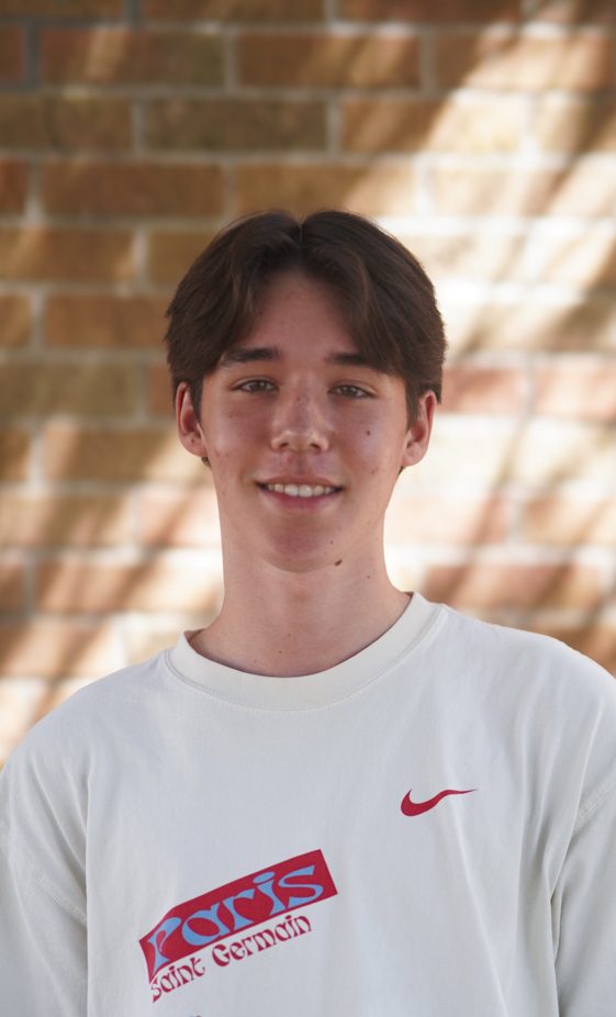
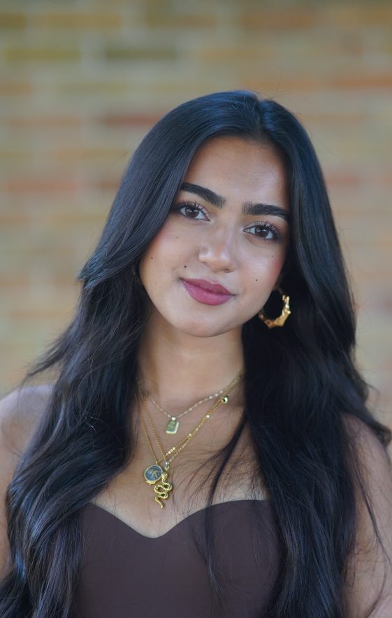
I have always loved drawing. I have done it almost my whole life, and up until recently, I merely thought of it as a hobby. This past year, I was one of two editors-in-chief for my high school newspaper, the Shield. During the creation of our first issue, me and my co-EIC, Alice Scott, divided up roles. I inherited the job of creating the cover.
The first cover I ever made was in regards to school shootings, and the recent changes our school had undergone to increase safety measurements. I hated the way this cover came out. We used a photo for it, which was extremely frustrating because it limited what we could do with it. I remember looking at the finished project and thinking to myself: “I could draw something better.”
So that’s exactly what I did. For our second issue I drew the cover. Not only did I love the finished project, but I loved the freedom that it gave me. I could create something for our cover that was completely abstract, and would be impossible to photograph.
I have always taken an art class, and at the beginning of the year, when I found out that art would no longer fit into my schedule, I was devastated. But newspaper was my priority, and to be a good EIC, I had to be in both newspaper classes, which required giving up one of my electives. This turned out to be a blessing in disguise though. Not only was I able to take on a leadership role this year, but I was able to continue to express myself creatively as well, and this time I was able to make an impact with my art.
Creating graphics has even made me change my college major. Originally I applied as a journalism major, but recently have changed to a double major in journalism and graphic design. My dream job is now to do exactly what I have been doing this past year: creating drawings and editorial graphics for a newspaper.
No. 1
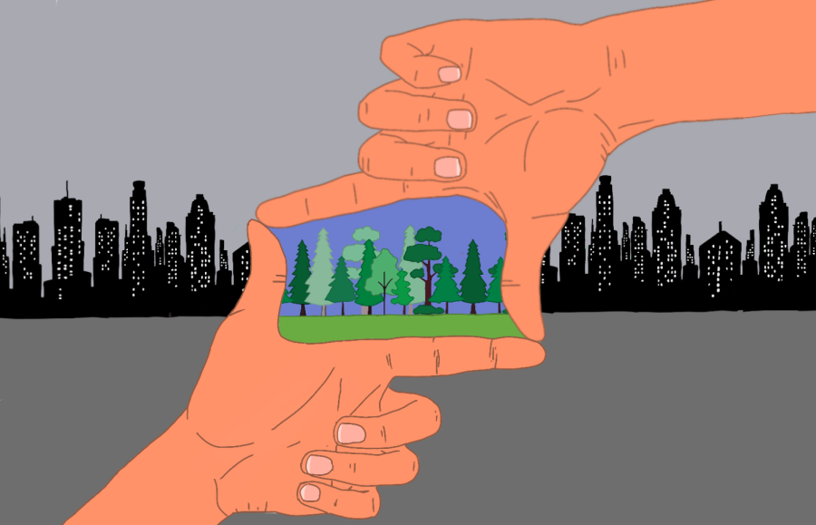
I created this graphic for the editorial page of our third issue. I wanted to represent the idea of how even though the current state of the environment might seem bleak, there is hope, and change can be made. I like this graphic a lot, and it’s a totally indie idea, which I think is cool. Looking back though, if I was to re do it, I think I would make the hands less orange.
No. 2
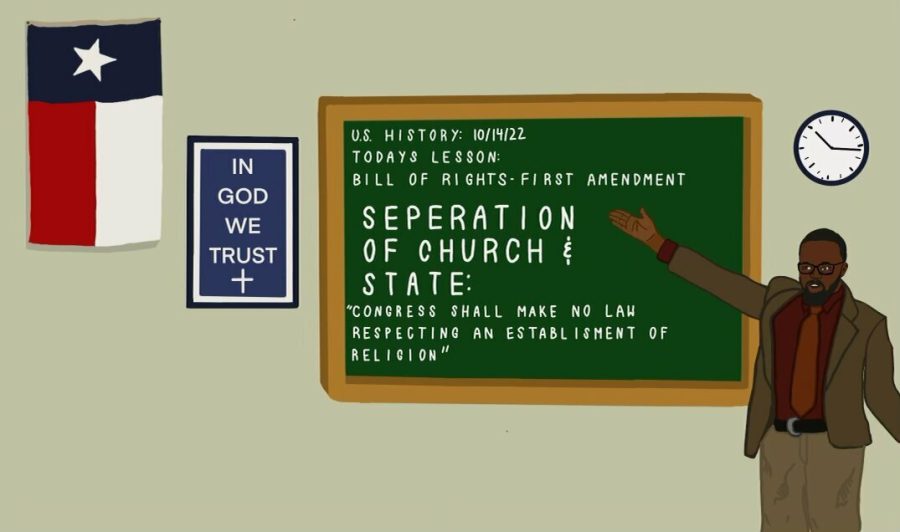
This graphic was created for the an op-ed column in our first issue. I wanted the drawing to show the irony of the Texas law which requires public schools to hang up posters that say “In God we trust” if they are donated. This is in direct opposition to the First Amendment which requires the separation of church and state.
No. 3
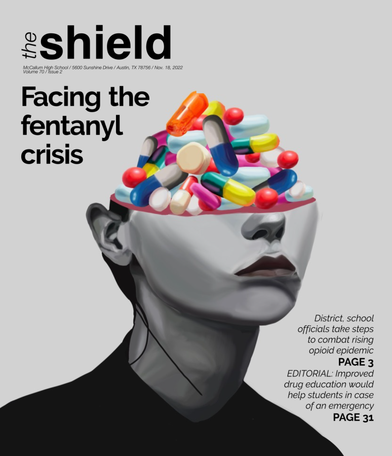
Our second issue covered the very sensitive subject of the fentanyl crisis, and the negative impact it has had on high school-aged children. I wanted to make the cover convey the idea that drugs re-wire the brain to seek the dopamine that they provide. I also made the pills colorful and almost candy-like to show how tempting they might be to high-schoolers.
No. 4
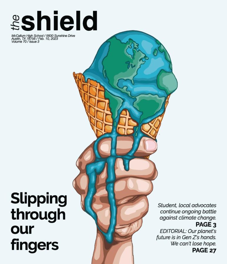
I have worked at an ice cream shop in Austin for the past two years. We are at our busiest during summer, as many of our customers seek ice cream as an escape from the unbearable Texas heat. My job was my inspiration for our third cover: I wanted to convey this feeling of literally melting due to the heat, and thought that a dripping ice cream cone would be a good way to represent it.
No. 5
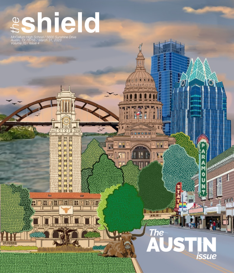
By coincidence, a majority of the stories we had pitched for our fourth issue were related to the development of Austin. Because these stories were talking about all the changes Austin was going through, I wanted our cover to represent some of the oldest and most memorable aspects of Austin. I combined images of the capital and Paramount Theater with that of the Frost Tower and Jenga building to create a collage that represents both Austin’s past and future. I really like this drawing, and I put a lot of work into it. If I had to do it again though, I think that I would plan ahead where I was going to put the title.


