


Kai Kirkham: NSPA Artist of the Year portfolio
My love of art began when I was younger, when I was gifted my first Garfield book by my dad. It was an old copy of Garfield Loses His Feet that was taped together at the spine and had a few pages falling out, but I quickly was obsessed with it; I read each strip a dozen times, never getting tired of the punch lines. Those comics gave me a way to entertain myself and feel seen, the characters and the humor becoming faithful friends that I could return to, when I just wanted someone to make me smile. For a kid who felt out of place almost everywhere I went, it was a blessing to have that one thing that made me feel like I belonged.
When I reached McCallum, my love of comics had only grown stronger, and I had collected as many different treasuries as possible; my favorites were Get Fuzzy and Little Orphan Annie. Though I had, admittedly, not considered art much as a career since I was younger, labeling “newspaper cartoonist” as an impossible career goal, I immediately was interested when I discovered the school paper didn’t have a comic strip. After much deliberation with myself, I pushed myself to try, and was shocked to find that the paper was interested in having my strip be a part of their content.
And so I became the staff cartoonist, always trying to push myself to do something new with each strip. Because I had not practiced art consistently for many years, I viewed the comic as a way to refine my skills and push my abilities. Eventually, when I officially joined the staff in class, I started to make designs for people’s stories, which really allowed me to work on different aspects of art; I used new programs, like Procreate and ClipStudio Paint, both of which refined my ability to pick up different softwares quickly. I figured out how to create pleasant color palettes, how to use Photoshop to improve the effects on my art, and how to edit my strips in an efficient way that made them look professional.
Most importantly to me, though, was learning how it felt to work in a creative setting. Being given the chance to connect with so many dedicated, intelligent and goal-oriented people made me realize how much I wanted to do design professionally. Spending time working with people on the art for their stories, and getting to interpret and design the things that they wanted showed me why art really mattered to me in the first place; the human connection. With illustration, you can work with somebody to make a design that complements and, hopefully, elevates their story, or you can create a story of your own that connects to people through the characters. Either way, you’re using your creativity to make something that helps somebody else, and to me, that’s the most fulfilling thing in the world.
My contributions to The Shield allowed me to explore my own abilities as an artist, and realize what I really wanted to do with my future. Without the chance to take part in MacJournalism, I wouldn’t have known what it was I really loved to do, and I wouldn’t have gotten the chance to make the comic that I’ve wanted to make for most of my life. I was, and continue to be, lucky to have gotten the chance to produce illustrations for people in the journalism department, and I will always be grateful to what they gave me. Never before had I gotten the chance to work in a place that understood my interests and pushed me to improve my skills.
When I was younger, I went to comics for a place to feel included and understood, and I still do. Comics and illustration make me feel at home, and I think they always will. But because of the opportunities given to me by Mr. Winter and the MacJournalism department, I’ve realized that I have more than that — because they gave me a place to feel included and understood and that room became a home.
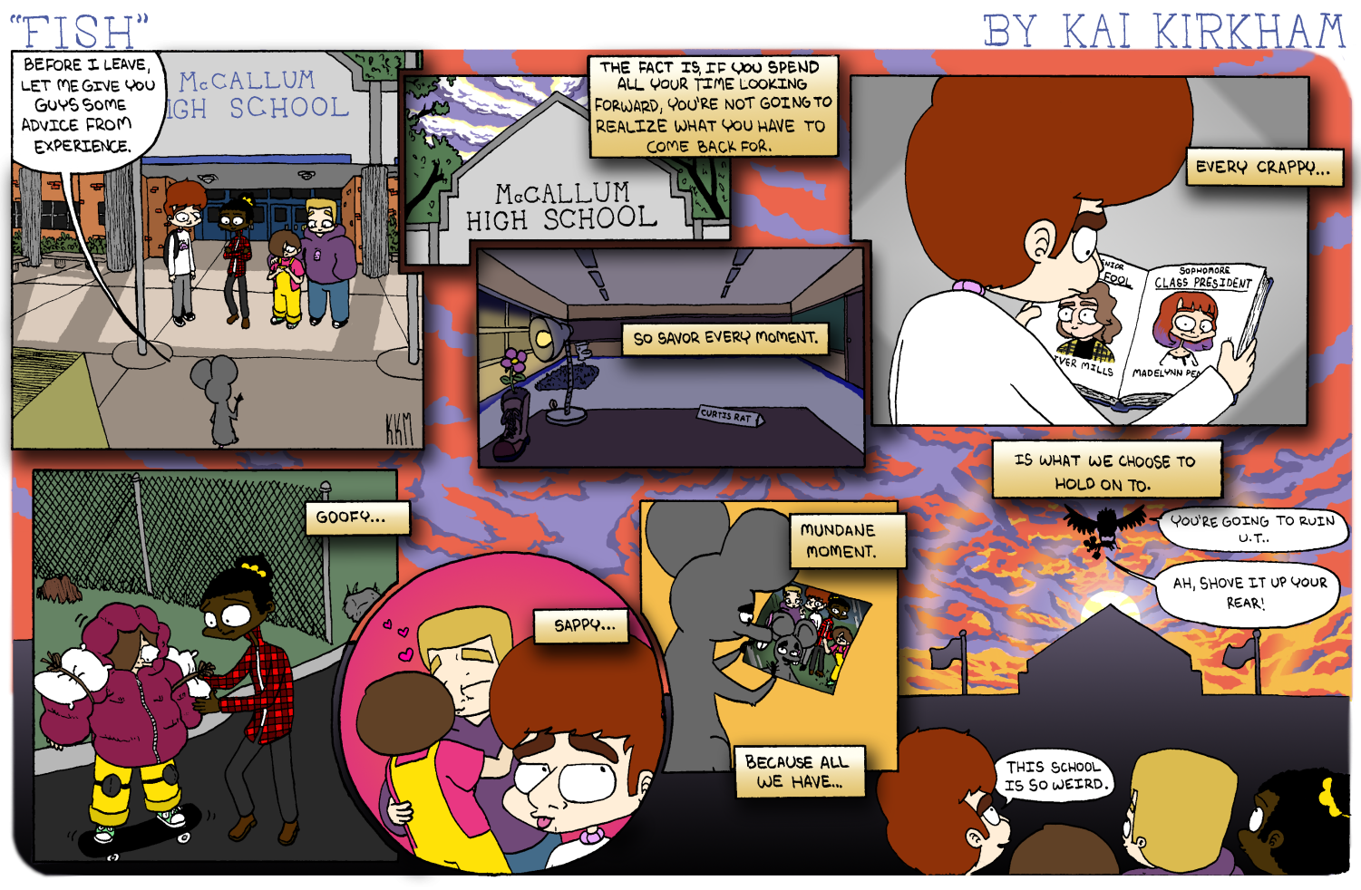
Fish No. 84: “Graduation” — This was the final “Fish” strip that I made for The Shield, and it was a long time in concept. From the moment I had conceived of the strip, I knew that I wanted to end with the rat character, Curtis, leaving the school. At first I considered ending it on a cynical note, with Curtis being picked up and taken off to be killed by a bird, right as he said “goodbye,” but the closer I got to my own graduation, the more I realized I wanted a slightly uncharacteristically earnest conclusion. I set up the bird as being Curtis’s friend—also named Curtis—so that in this strip, Curtis the Rat was carried off into the future by “himself.” The final strip ended up being a collection of moments in the characters’ lives, all framed around Curtis’s parting advice.
Each moment is a reference to previous strips; the desk with the flower in a boot is a callback to the series in which the kids give Curtis a room in the school, the flower in the bot having been shown consistently throughout the series as not having bloomed yet, until this final strip. The yearbook is a callback to the series in which the kids run for student council, the skateboarding is a callback to a series in which Frankie tries to teach Nessie to skateboard, and it almost kills her, the kissing is a callback to the Valentine’s strips with Nessie and Manfred, and the final panel is just one appreciating that Curtis finally has friends. I’m incredibly proud of this strip, as I think it’s the most different looking strip I’ve ever made, and the illustrations are the best I ever did in my time at The Shield. To me, it was the perfect way to end the series.
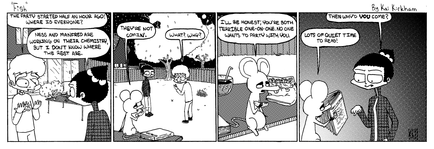
Fish No. 68: “Party” — This was my personal favorite-looking weekly strip in the entire run of “Fish.” The premise is that Stephen and Frankie are throwing a party, but nobody has shown up except for Curtis. He informs them that the reason no one came is because nobody likes talking to them very much, but he came because he knew the party would be quiet enough for him to be able to read. The joke itself is not my personal favorite of the series, but I decided in this strip to utilize a more detailed background than usual, just to mix up the usual framing of the strip. Almost every other comic in “Fish” takes place at McCallum, and so I decided to use this opportunity to show a more detailed outside location to widen the perspective of the strip a little bit. Beyond this change in setting, I also knew I wanted to make it clear that not only was their party completely empty, but it was not very well set up, either. Using a more detailed background allowed me to show the emptiness of the yard, as well as the pathetic spread they had on the table. All in all, I’m very proud of how the final product turned out.
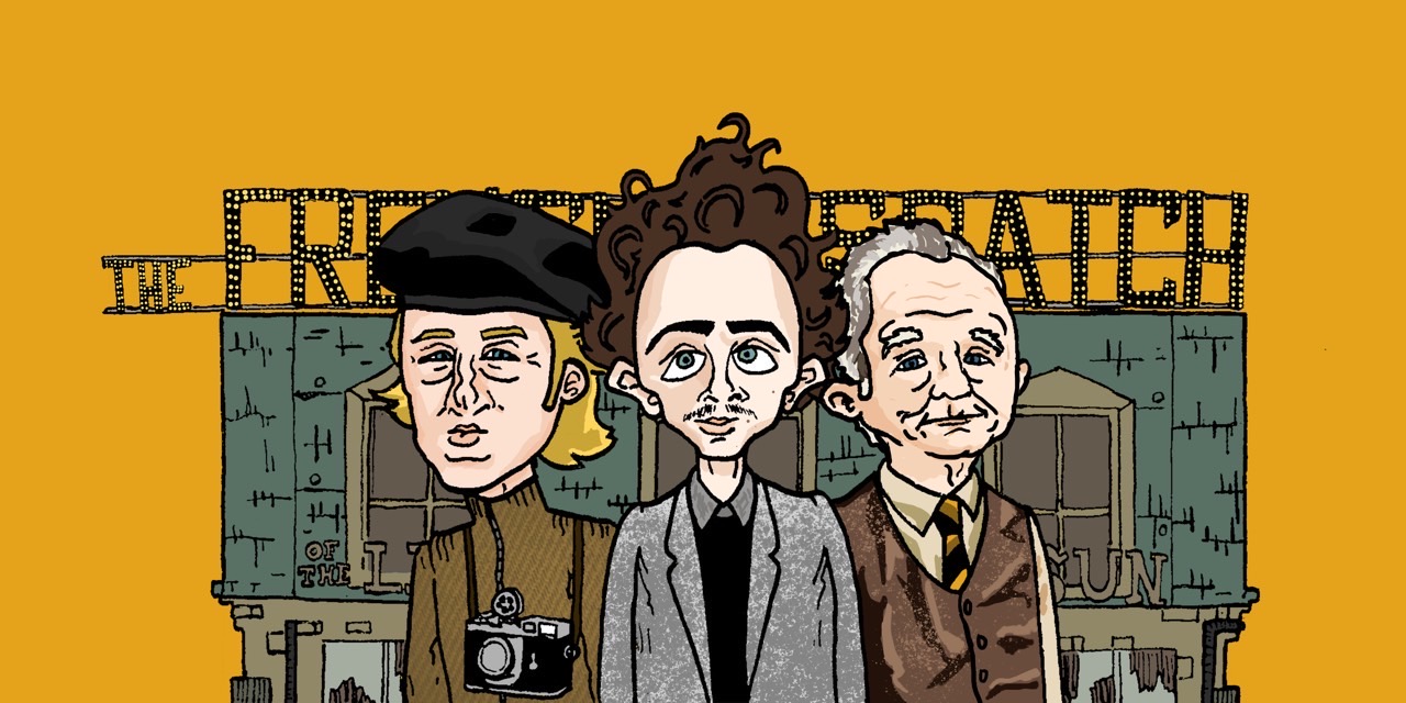
French Dispatch delivers on all fronts —When Wes Anderson’s avant-garde movie, The French Dispatch, came out, The Shield decided to review the movie. I was approached by the writer of the story and asked to do an illustration for it, which I excitedly said yes to. After a few sketches of concepts, I consulted him on which he preferred, and he told me which was his choice. The final version of the illustration was drawn to fit with Wes Anderson’s directorial style, by making the framing and colors of the illustration fit with his own usual choices in that regard. I had the three characters looking directly at the camera, as he often does, and used bright yellowish-oranges, which I’ve noticed are usually very present in his films. The three people drawn in the illustration are Owen Wilson, Timothee Chalamet and Bill Murray; all of whom played characters in the movie. I drew them as caricatures, because I felt the exaggerative style of caricatures fit very well with Wes Anderson’s quirky and offbeat style of filmmaking. In the background of the illustration is the building in which all the characters work in the movie. The illustration as a whole was intended to be an homage to Anderson’s filmmaking style and frame the mood of the review as a whole.
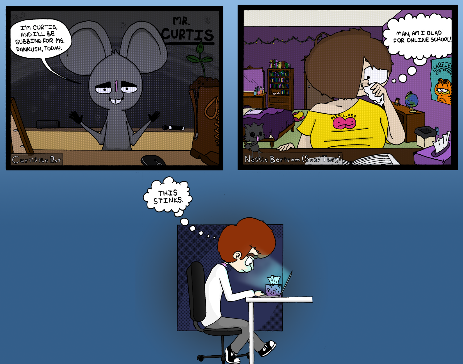
Should hybrid learning return? — This graphic was designed to go with an opinion piece about online learning, discussing the pros and cons of it, and how people felt about it as a whole. The author of the story approached me about illustrating for it, and asked if I could use “Fish” characters as stand-ins for people in online learning, which I was interested in, and excited to try. I used the pessimistic character, Stephen, as the stand-in for people who hated having to learn virtually; the optimistic character, Nessie, as a stand-in for those who were happy about it; and Curtis as a substitute teacher. First, I penciled and inked the graphic on paper, before scanning and coloring it in Photoshop. I’m happy with how it turned out. I think it successfully communicates what the story was hoping to achieve.
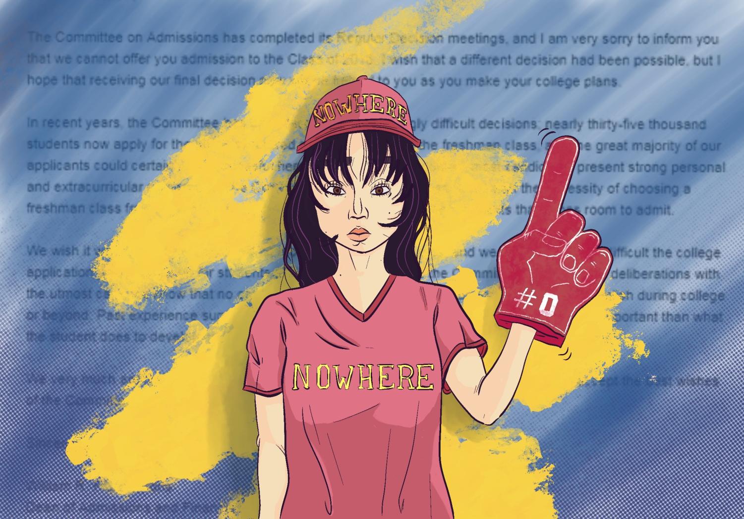
Accepting rejection — When we had reached the point in the year in which most people applying for colleges had received answers from their schools, the staff came up with the idea to write a story based around how to handle college rejections. For the graphic, I knew I wanted something that could communicate that sense of hopelessness and general disillusionment that arises from a college rejection, while still keeping it lighthearted enough to not be even more depressing. I came up with a few concept sketches, ranging from very lighthearted to quite unhappy, and asked the staffer which they preferred. She pointed to this option—the slightly morose one—which had also been my personal favorite, and so we agreed to go with that design. I made it in Procreate, which I had never used before for a newspaper graphic, and sent it in to her. In the piece, the rejected student is wearing college merch that says “nowhere,” with a foam glove that says “#0” instead of “#1.” In the background is a faded college rejection letter. I’m very happy with how the piece turned out, as I think it really does communicate that feeling of being numb and lost after rejection, while still being a little funny.
Your donation will support the student journalists of McCallum High School. Your contribution will allow us to purchase equipment and cover our annual website hosting costs.