Normally I feel a sinking feeling when two words are placed next to one another: page and design. This is a by-product of many nights spent slaving over InDesign pages and being confounded by the refusal of the text to fit within the specified columns. I harbored much anger for the final two weeks before the paper was finalized. Interestingly enough, everything else about the paper elated me. I loved asking the revealing questions in interviews, sculpting the story and that magic moment when the paper is dropped on the desk in front of you. That feeling of running your fingers over the by-line with your name, getting the ink smudges everywhere and feeling the satisfaction of your hours of hard work paying off. What I really loathed was that middle part where I took my writing from words on a google doc to a story in perfect format with the right margins, pictures and pull quotes.
This year brought new responsibilities as I took on the roles of a section editor and co-online editor in chief, both roles that simultaneously exhilarated and terrified me. The pandemic also complicated things, to say the least. Without being able to pull up a chair and meet with staffers and fellow editors over page design, communication over the intricacies of formatting became that much harder.
With those challenges, a new chapter of my high school journalism experience was born, giving me the opportunity to learn more about the basics of layouts, find creative ways to fill white space and diversify web elements to complement the copy.
I can vividly recall Zooms until 2 a.m. with my fellow editors stressing over the “danger pages,” texting our design editor Anna about font size and cutouts and ingesting lots and lots of coffee. That aversion to layouts and the dreaded “middle” part of making our newspaper began to disappear altogether as I was thrown into the deep end design-wise. Unlike learning how to swim, I thoroughly enjoyed both the destination and journey.
Page design now has a special place in my heart. At one point it was a phantom of my computer giving me much unwanted yet not unwarranted stress. Now I see design as an additional storytelling medium, giving words an aesthetically pleasing and visually enticing frame.
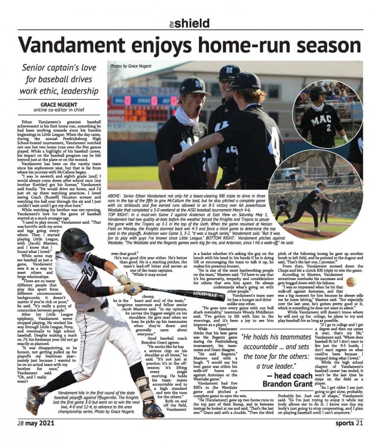
Vandament enjoys home run season: One of my favorite page designs was from the last issue of our print newspaper. Earlier in the year, we had received a critique about pages being very uniform, bland, similar, and – well, for lack of a better word, boring. After using Pinterest boards to find inspiration to diversify and spruce up the page design, circles became a go-to. Suffice to say that by issue four we were still looking for a multitude of ways to spice up our pages. For a sports feature page, a cut-out worked perfectly, accompanied by three other graphics to balance out the elements. At first, the idea of a website tease for other baseball stories enticed me, but after using google to find some inspiration, a cutout seemed like the best option. I chose the pictures used to try and demonstrate the versatility of the player the story was about. This led me to choose three different pictures for the top right, and I made sure to use some with the same color scheme so one picture would not clash with another.
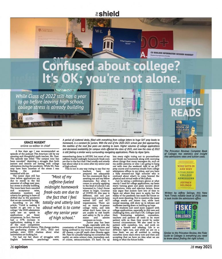
Confused about college? It’s OK, you’re not alone: The next page design came in the same issue and was a vehicle to deliver my column about the class of ‘22 being stressed for college. For this design, I knew that I had less copy to work with than usual and I wanted to find a dominant photo that encompassed different aspects of what would be on a desk of a high school junior. Luckily one of my fantastic fellow editors had exactly what I was looking for, with different colors and books all over the dominant image. I wanted to capitalize on the color and symmetrical lines from the image, so I backed my headline and subhead with a translucent color box and created a sidebar of the same medium. My sidebar had sat empty until my advisor mentioned a book he was reading regarding college admissions, prompting me to show some useful reads regarding colleges.
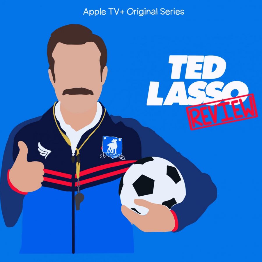
‘Lasso’ way relies on exuberance to reel in audiences: The online design for this page went along with a movie review I actually wrote at 2 a.m. I made the graphic based on the TV promotions, Ted’s distinctive mustache included. The show I was reviewing had a very interesting inspiration, so I hyperlinked different pages and added in one of the commercials that ‘Ted Lasso’ was based on. Finally, without any other images and to characterize the quirkiness and personality of the show, I settled on a tweet to insert to help break up the text.
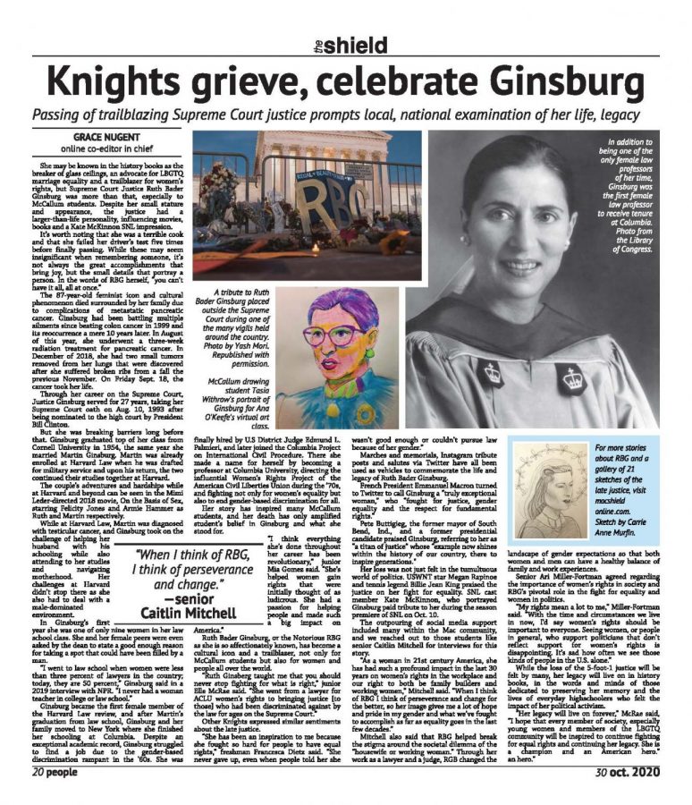
Knights grieve, celebrate Ginsburg: One of my first page designs of the year was of a story I had written surrounding the passing of Supreme Court Justice Ruth Bader Ginsburg. While I used a more routine L-shaped page design, I tried to choose colorful and bold images to enhance the page from its original generic nature. The dominant image is a black-and-white photo of Ginsburg from the Library of Congress during her tenure as a professor at Columbia. I chose the black and white to be dominant to complement the colorful student drawing of RBG and the tribute at the capitol; both boast an array of pigments. In addition to the three photographs, in the top right, I added a tease to the website as we had a gallery of student sketches of the late justice that I wanted to showcase. I wrestled with this design for a while as I struggled to find a way to demonstrate the profound impact Ginsburg had on McCallum students.
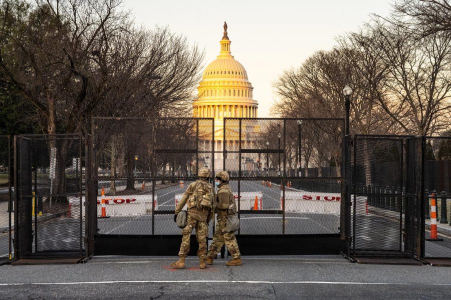
Knights react to a week in Washington that began with insurrection, ended with Trump’s second impeachment: One of the most difficult and complex designs this year came from a poignant story about the Jan 6insurrection at the capital. While a very stressful time for the nation, co-editor-in-chief Ellen Fox and I searched the Flickr creative commons high and low for pictures that would reveal the effect the insurrection had on both the nation and McCallum students. We settled on a featured image of national guard members closing barriers at the capitol. Along with this featured photo we added in pull quotes, other pictures of Washington from creative commons, a wonderful infographic about former President Trump’s second impeachment and ended with a picture illustrating how the insurrection was viewed at McCallum.


