[Best_Wordpress_Gallery id=”102″ gal_title=”Sophie design portfolio”]
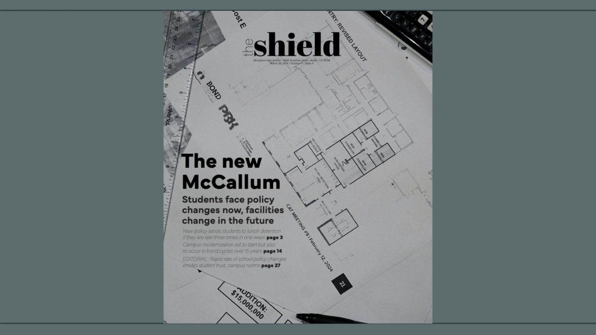
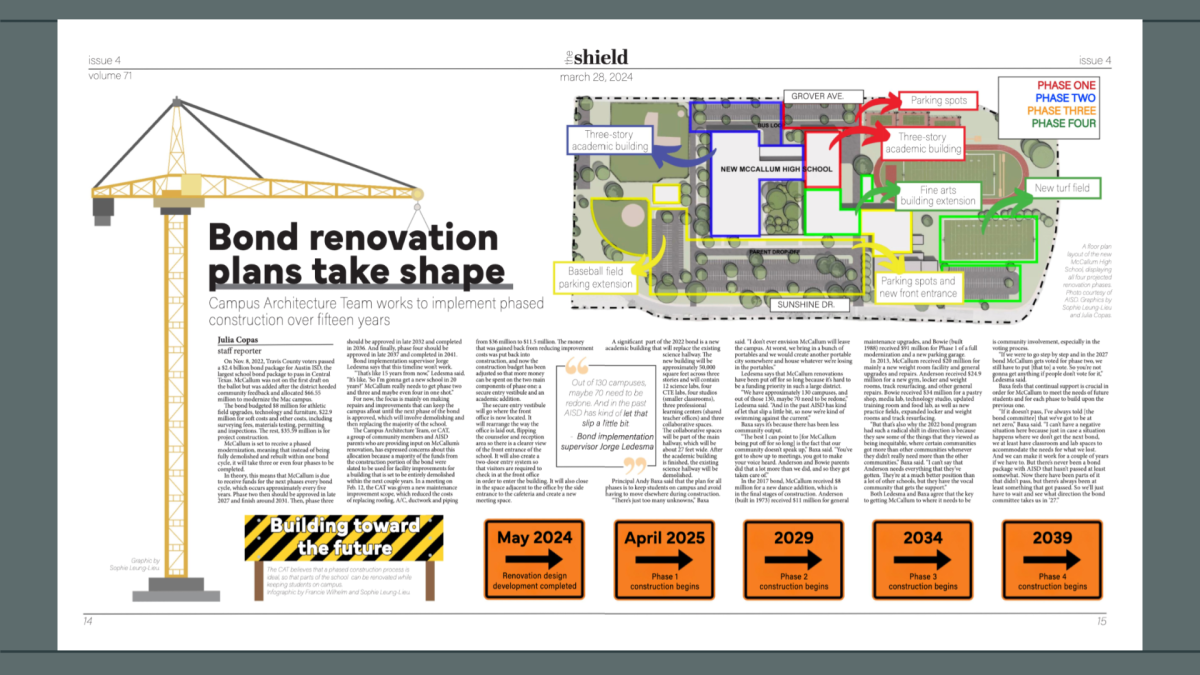
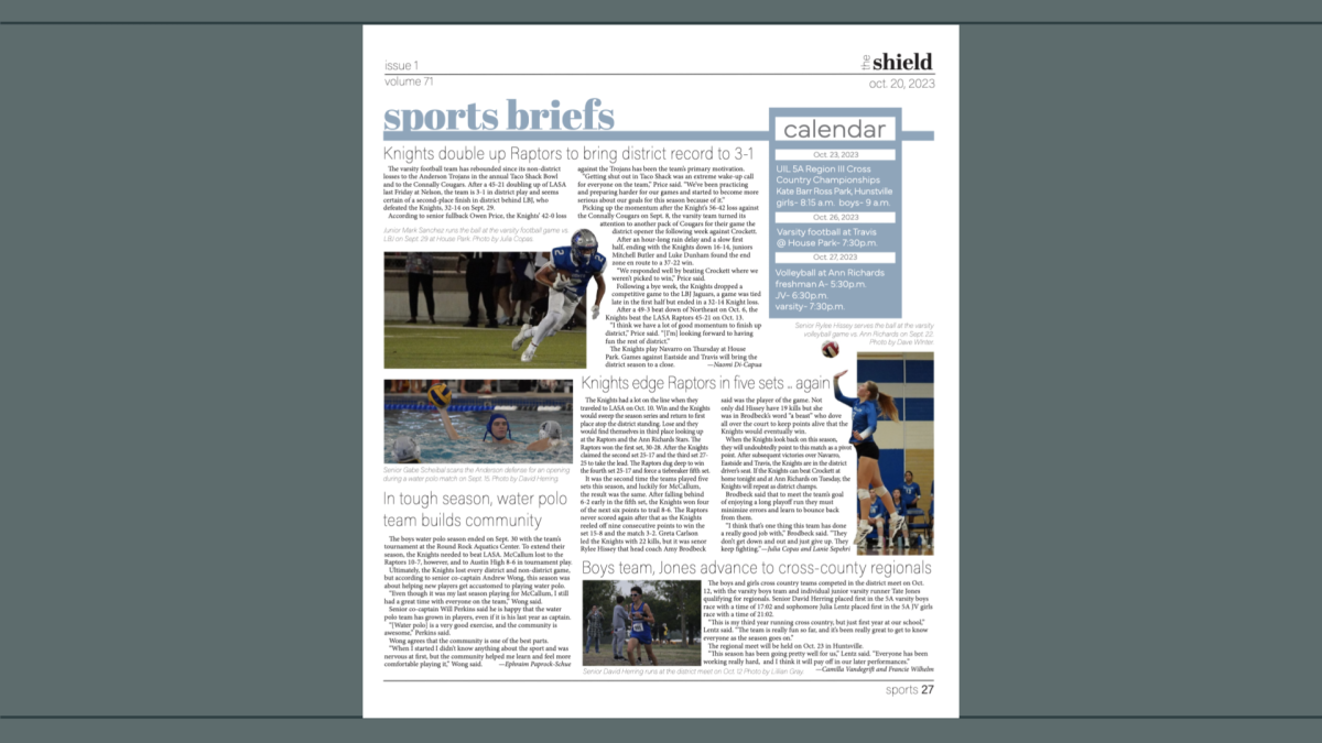
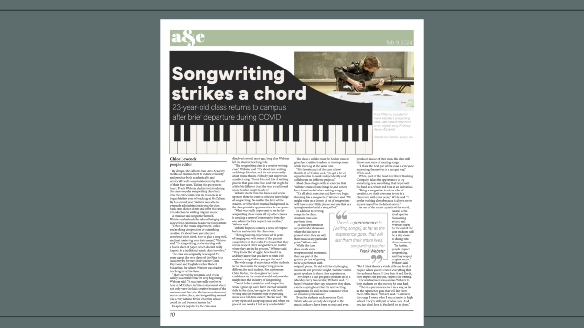
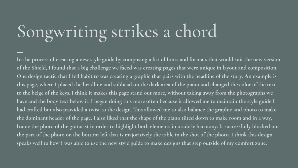
When I attended the ILPC Summer Workshop last July, my work to reconstruct our print design at the Shield began when I opened Adobe InDesign for the very first time. From that day forward until the first day of my senior year, I spent countless hours navigating the foreign software, exploring the tools and slowly building the style guide that would rebrand the Shield after a switch in software. Using the new fonts and formulas I had carefully matched together for the new guide, I soon created a new templates for a table of contents, back cover, editorial page, front cover and standard pages.
When the school year began, my job description extended from teaching design to being an IT expert, as I took charge to set each staffer and editor up with InDesign and walking each person through the steps to begin their design journey for the year. Little did I know, that was only the beginning of my efforts to teach design.
After issue 1 had published, I reflected on our first couple of months as a staff. We were successful in setting up a new software, but the potential I knew our staff had in achieving high quality design had not been reached. I took it upon myself to create a presentation of what we needed to fix and how to improve our design as we headed into next issue. Following the presentation I had made, design had begun to improve as staffers became more inspired to step outside of their comfort zone when it came to creating pages. I became more and more proud of how far I had taken my peers in the process, as it was clear in the quality of our issues that everyone was getting the hang of it. My adviser, co-editors-in-chief and I fell into a good rhythm of getting work done and putting out more pages consistently, while keeping our social media and website running smoothly. I found myself designing pages with ease, learning new cutout tricks and making fun crosswords for the back cover of each issue.
My senior year ended as quickly as it began. As the EICs worked to prepare the underclassmen to run MacJournalism for the following year, I had my own concerns about design. While we had put out four issues to be proud of, I worried that a majority of the work had begun to fall on me and some of the editors. In order to well-prepare next year’s editors for the late nights of design and to teach them things I had to learn on my own, I decided to create a required design workshop for anyone applying to become an editor. My goals for these sessions were to create a smooth transition for the new editors and to show them everything I have learned in my two years as design editor to hopefully provide them with a shortcut of information they can use to continue the legacy of the Shield.
As I conclude my work for MacJ, I am thankful to be able to reflect on the many positive contributions I have made to help the program grow and flourish to its amazing potential. I have learned, struggled and grown as a leader and a student from journalism and I would not trade a moment for the world. I hope that my work this year to transition the Shield into InDesign and to bring new design techniques into our inventory will pave a pathway for younger journalists to find their passion for design that I found in myself.
To view this portfolio as a Google slide show, click here.
