This year I found new ways to contribute to the newspaper staff that I hadn’t considered before, by designing graphics and cartoons. I got to work in new areas and experiment with different programs and test my skills as an artist and journalist. It made me feel like I really was contributing other skills and bringing new things to the table.
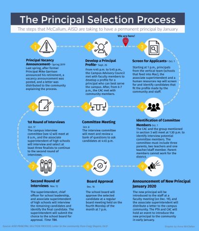
One of my first pieces I did for The Shield was a timeline on the principal selection process since we were going through the process ourselves and wanted to have an easy way for readers to understand the process. I used Visme to make this along with my other infographics. At first I was thinking this needed to be detailed, have all the information that I was given and be as detailed and thorough as possible. But, I ended up running short on space, which made me realize that I only really needed summaries of each step, and in some cases not even complete sentences, instead including just enough information to get the point across so as to not over-complicate it.
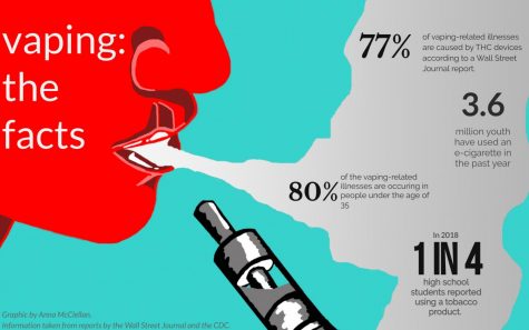
My second piece is an infographic I made for a story I co-wrote on vaping. For this piece I wanted to do a sort of pop-art type style so I could grab the readers’ attention and get the facts straight to them. I wanted it to have lots of color, but in the end decided that choosing complementary colors with black, white and grey accents and gradients so that it would be simple, yet also have a sense of unity. At first, since it was about vaping, I also felt obliged to include many pieces of information, but then realizing that I would have limited space, I thought it would be interesting if I added the information into the smoke coming out of the vapers’ mouth, using only the most important pieces of information.
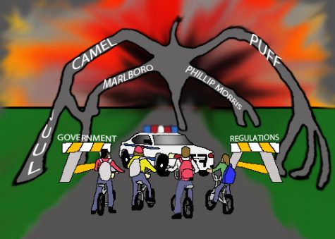
My first cartoon was requested by a fellow staffer who needed a cartoon for her opinion piece on nic regulations. I was talking to her and my advisor because at this point I hadn’t done anything but graphics, and we came up with an idea based off of a Stranger Things poster. Using Photoshop, I designed and created an opinion-cartoon that gave readers a visual perspective on what the article was saying. I was taught a lot of patience creating this piece, and definitely learned to pay attention to details.
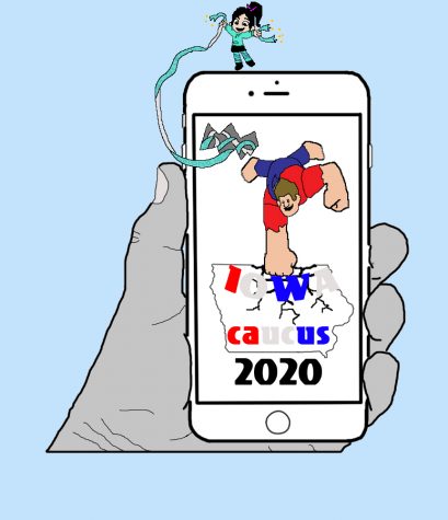
One of the opinion pieces I wrote was about the Iowa caucus. For this I talked with my adviser, the amazing Mr. Winter, and he suggested the idea of a Wreck-it-Wralph and Princess Venelope “wrecking” the Iowa Caucus app. I wanted readers to get the idea of what the story was about before even having to read the article to give them a preview of what it would cover.
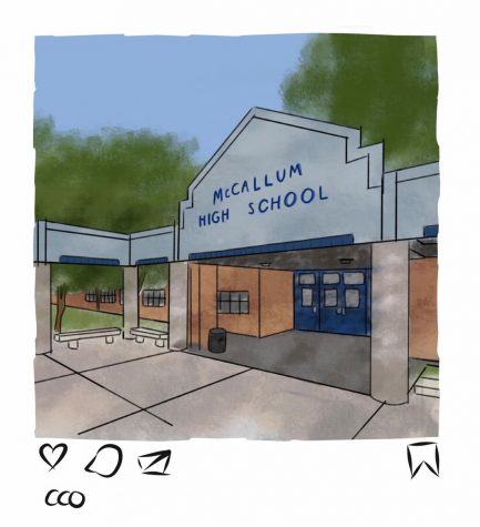
My final piece I did this year, and the final piece I included, was for a story one of my fellow staffers wrote on Instagram removing likes. I thought it would be interesting to make it look like part of the page was someone’s Instagram feed. During the design process I didn’t just want to have a random picture, so instead I based my cartoon off of a picture of the front of McCallum, since it was a way to draw in the community.
I learned how to scale things down and up, make sure that objects were in a straight line or equally distanced, and how to make things complex, but also have a simple look. It took me time to learn some things, and over the course of the year I switched from program to program to try and find one that I could draw my cartoons on best, and after I did it still took time to figure out my style, and how I wanted my cartoons to look. I learned that graphic design is both very technical and mental, and not everything will turn out exactly how you planned. Sometimes you may need to adjust your plan, other times you may not. I was able to keep getting more and more technical and creative as the year went on, and I kept on learning more and more about what techniques did and didn’t work for me. I learned a lot of patience, and was able to get things done that needed to be done. I was able to become a better journalist, help others on the staff, and contribute more. But I wouldn’t have been able to do it if I hadn’t been encouraged by my amazing fellow staffers and advisor. They deserve all my thanks and appreciation because they really helped me come up with cool ideas, try new styles, and give me critiques. They encouraged me to keep going, and I just kept on improving from there.


