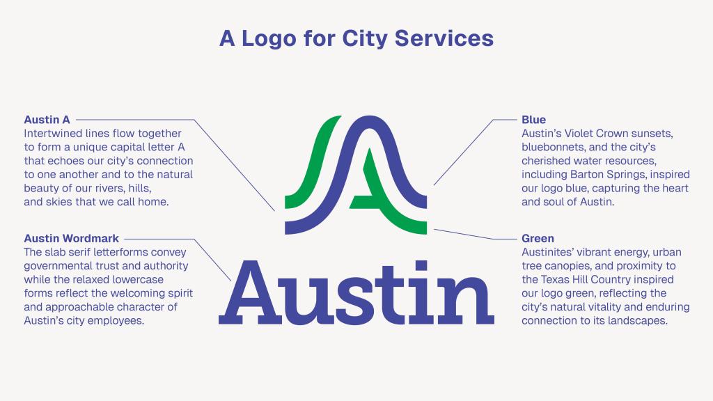
On Sept. 4, Austin announced that it would be rebranding the city with a new, unified logo. The city claimed that the pre-existing Austin seal was not cohesive and well recognized enough, and that the change would provide Austinites with trust and confidence in their city.
Well, one look at the new logo proves otherwise.
The logo change is a waste of city funding, and quite frankly, ugly. A change in city branding is not going to rally trust from community members, and is not the focus the city needs right now.
In total, $1,117,558 was spent to update the brand, including $200,000 for design, $640,000 for vendors, and $115,000 for public awareness campaigns. The timing for this is incredibly ironic as Austin’s new budget proposes tax increases that will raise homeowners’ taxes by around $125 annually. This leaves people wondering how well their tax dollars are spent.
Not to mention the host of other problems the city could be addressing with this money, like funding for emergency responders in the city, which are currently facing an $8.3 million cut.
Not only is the money spent on the rebrand outrageous, but the end product is as well. Many people online have been slandering the new logo asking how it took $1.1 million to come up with the letter A.
“This looks like an eco-friendly bus logo,” wrote one Reddit contributor.
People have even gone so far as to take it upon themselves to redesign the logo as fast as they can and compare it to the official design. While others have already graffiti’d joking stabs at it around the city. And although it is all in good fun, there is a rising frustration to it.
Austin has long been known for its “weirdness”. Characterized by live music and an abundance of creativity, it has created its own quirky personality that Austinites are so fond of.
However, there is nothing weird about this logo.
“The logo itself reflects the hills, rivers, and bridges that serve to connect us to one another,” said Austin Chief Communications Director Jessica King.
And while it clearly does that, it does so in a boring and washed-out way. The logo is obviously the result of a corporate council, and it is sad to see the city represented so devoid of its iconic personality.
In some ways, it is almost a reflection of the direction Austin is shifting to as it moves further and further from its old spunk and magic, and is steadily gentrified and taken over by corporations.
The apparent goal of the rebranding is to give coherence to all of the city’s projects and sectors so that locals can easily identify and trust them. However, as the branding is slowly switched out across the city, they will refrain from updating first responders’ uniforms and branding.
This undermines their own argument for why the branding is important.
They don’t update emergency services because it is something the community should see and immediately trust and recognize. The old seal is something the general public recognizes as the city of Austin. And while admittedly the seal is not visually pleasing by any means, there is no reason to be spending over a million on something as inconsequential as coherence.
Another reason they might be continuing to use the seal in this instance could be that the new logo lacks a sense of officialness to it, as the design clearly strives for modernity over coherence; it completely lacks symbolism that clearly connects it to Austin. This ultimately leads the logo to evoke less trust with the public.
Although the previous logo for Austin will hardly be missed, there is something the city could have learned from the creation of it. The past logo was created by San Francisco artist Ray Frederick Coyle for a flag design competition. It would have been much more cost-effective to hold another competition of sorts for Austinites to have a chance to design their own logos, especially because there are so many artists in our city.
Instead, the city spent $200,000 just for the design of the logo, which, by all accounts, was a waste.
For the city to put that much money and effort into an impersonal design that hardly connects to Austin was a completely impractical use of the city budget that could have been used on more pressing issues. Although a rebranding will be an improvement, it is unnecessary, and the result of their efforts is incredibly underwhelming and does not represent our city.


Wren V • Oct 4, 2025 at 2:54 pm
beautiful beautiful so amazingly written