
Ever since I can remember, I have loved to create. For me, art has helped me express myself and provides me with joy and fulfillment. I find beauty in the everyday, and use my creativity to add meaning to my life. As I have gotten older, art has become a way to convey complex ideas and stimulate conversation.
My training in the arts began when I was 8 years old, as part of a studio focused on classical arts. Along with fundamental techniques, I learned how to appreciate art. Because of my deep interest in the arts, I was compelled to apply to the fine arts high school in my city. At McCallum’s Fine Arts Academy, I have been able to further develop my classical arts background and explore new art forms. I have found that I enjoy creating in almost every medium that I have had the chance to try. During freshman year, I took a foundational course that allowed me to explore printmaking, ceramics and sculpture. Being in a fine arts high school opened my eyes and made me realize I wanted to broaden the scope of my creativity beyond traditional drawing and painting.
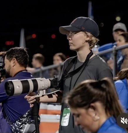
In my sophomore year, I joined my high school newspaper, The Shield, to help my art reach a broader audience and combine my interests in writing and arts. I quickly realized I needed to learn how to make my art applicable to a digital format, so I began experimenting with Procreate to make graphics for the stories I was writing for the newspaper. After practicing for about a month, the editors of The Shield asked me if I wanted to start making the cover art for the newspaper. During this school year, I made four out of the six issue covers of The Shield.
Being part of The Shield not only helped me to expand my horizons in art and try a new medium, but it also provided a new community for me. As a staff member of the Shield, I have had the opportunity to work with students with a range of interests and skills, and have learned the importance of teamwork. For the upcoming school year, I was selected to serve as design and visuals editor for The Shield. It has been inspiring to create in a completely new context, and I hope to continue exploring ways my art can reach, inform, and inspire others.
Piece 1: Can Texas Beat The Heat?
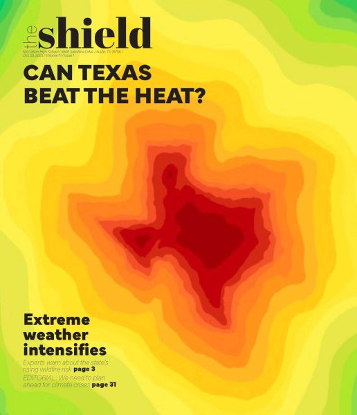
Our first issue covered the topic of climate change in Texas, focusing on issues of extreme weather and wildfire risk. To align with the theme, I wanted to create an image that portrayed the increasing intensity of extreme weather. I used the concept of a heat map to provide a visual cue indicating intensity and heat. I chose the color gradient in shades of red, orange, and yellow to indicate heat radiating from within the state and outwards.
Piece 2: Technical Difficulties
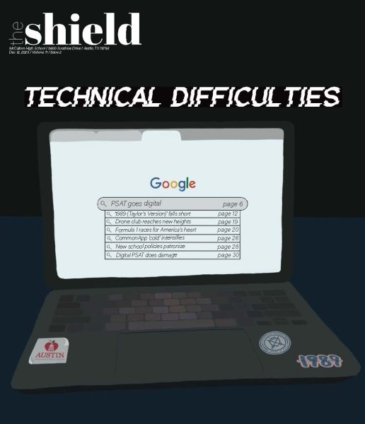
Issue two was focused on technology and its impact on students, both positive and negative. For this cover, I drew a student’s computer on a desk with an open Google search browser. The dropdown shows technological issues of relevance for high school students. On the computer I drew stickers that I thought would be on a student’s computer that are also related to the stories within the issue. On this cover, I wanted to emphasize small details that are significant to the issue. I collaborated with the editors to use a font that would look like it was glitching.
Piece 3: New Beginnings
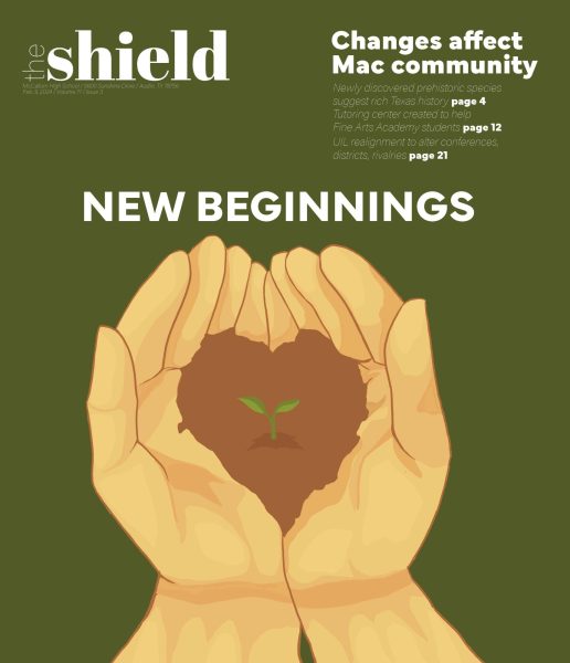
Issue three focused on the beginnings of a new year, and the changes ahead for our high school. I wanted to convey the ideas of positivity and hope. I also wanted to show how change begins with a small spark. I thought the idea of a seedling cradled in a pair of gardening gloves could show this idea. I made the soil in the hands shaped as a heart to symbolize that change requires passion, dedication, and love to take shape and grow.
Piece 4: Wildfire Risk
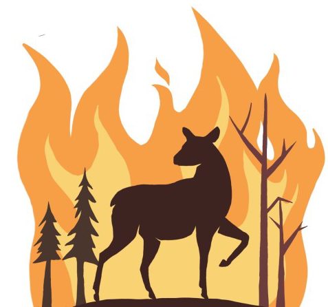
I created this graphic as part of a story I investigated and wrote, entitled “Central Texas wildfire risk increases due to high heat.” This was the first time I had made a graphic on Procreate, and I used blocked-out silhouettes layered on top of each other to create the image of a deer fleeing a forest wildfire. I used sharply contrasting colors to indicate shadows cast by the fire onto objects in the forefront. The deer is looking back over its shoulder, symbolizing a mix of fear and sadness for what it is leaving behind.
Piece 5: Near Misses
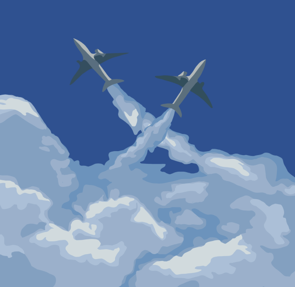
I made this graphic for a news story I investigated and wrote, entitled “Near misses cause concern.” The two plains are depicted almost colliding, nearly missing each other. Clouds have been a central element in many of my paintings, and I wanted to incorporate them into the graphic I would be using for this story. I tried to recreate the technique I would use if painting, but instead in a digital medium. I used many of the same techniques such as layering and varying the hues to create depth. This piece allowed me to translate some of my fundamental art training into a new medium.