
Coming into the school year as co-editor-in-chief, I anticipated creating numerous page designs, but I was still unfamiliar with Adobe InDesign and many of the design rules we use for our print paper. After researching and watching numerous tutorial videos on how to create cutouts and utilize the various design elements embedded within InDesign, I felt slightly more confident entering our first issue’s design process.
This year, we heavily focused on coming up with a theme for each print issue. This theme would largely affect page three and the editorial, possibly even the double truck. The editors and I created the issue ladder, attempting to incorporate as many different writers as possible. The beginning of the year is always a challenge as we try to teach as many new staffers the art of InDesign. Because of the time constraints of the issue, the designs ended up being pretty rough. Knowing that we had to get the issue out by a specific deadline, my co-editor and I began to divvy up the workload. Throughout this process, I mastered the dollar bill test and cutouts. After the first issue went to print, I looked at ways we could improve. I wanted the double truck to be more eye-catching and include more unique design elements. I wanted there to be more variety in the fonts used and the page styles.
Going into our next issues, we talked with the staff about what we liked and could improve on from our first issue. I then spent time in class and after school working with staffers on the page designs, making sure they understood the design rules we follow as a staff and creating a cohesive design with the rest of the issue. I struggled with perfectionism at times as I tried to make sure the smallest details, like the folios, were exactly aligned and correct. As the year went on, the deadlines got shorter and that meant picking up the pace in the design process.
For the final issue of the year, a pullout in the print issue that included a “seniors only” edition would be run by the junior editors. This unique design process meant that I could help in any way possible to make the transition to the next school year easier. The senior issue included a different page style and class structure. Through many late nights and early mornings, the fifth and final issue of the year was printed in record time.
As I reflect on the entire school year and the five issues we printed, I am incredibly happy with how each one turned out and the many contributions the staff as a whole made to them. I believe that each issue tells a different story about the moment in which they were printed. I see how the staff improved its design skills as the year went on, as mine improved as well. I hope that the work I put into the issues this year and the high design standards we set as a staff will continue in the future.
Print Issue No. 1, Oct. 29, 2024, page 24
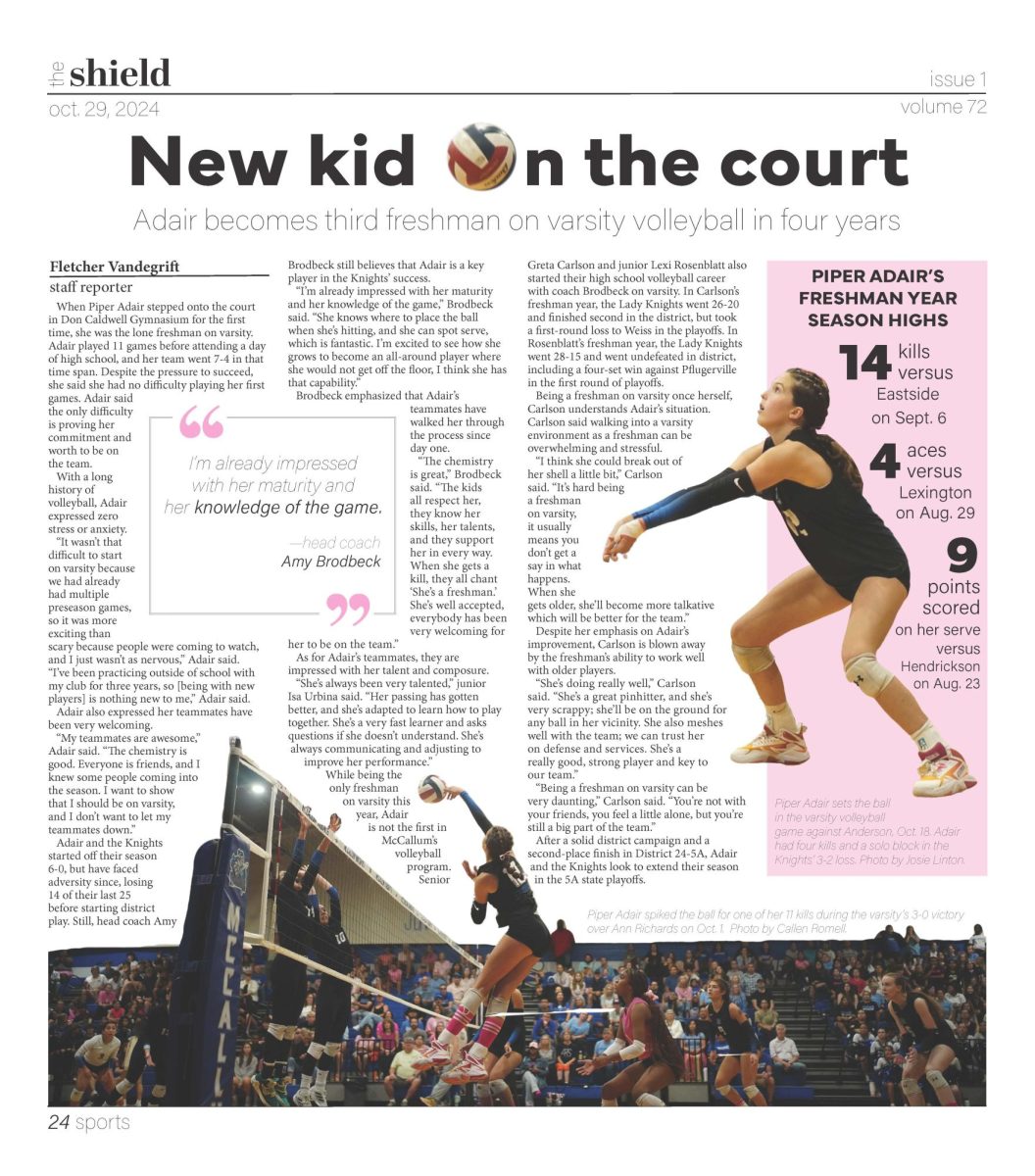
“New kid on the court”
As I begin designing pages on my own at the beginning of the year, I tried getting as comfortable with cutouts as possible. I researched lots of ways to incorporate different styles of cutouts onto pages and decided to cut-out a photo in half and create a sidebar with another cutout. The second cutout was also done to ensure there would be a photo of the player’s face on the page. Due to the size of the sidebar, the volleyball landed perfectly in the headline. Because the story was a profile on a freshman on the varsity volleyball team, having player stats in bold on the page gave the reader a bigger picture of the player and their impact. This became one of my favorite pages designed early in the year because of the action shots shown and the balance of all the elements.
Print Issue No. 3, Feb. 21, 2025, pages 23-25
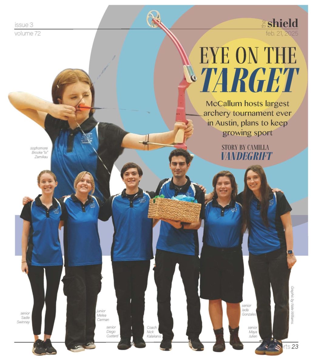
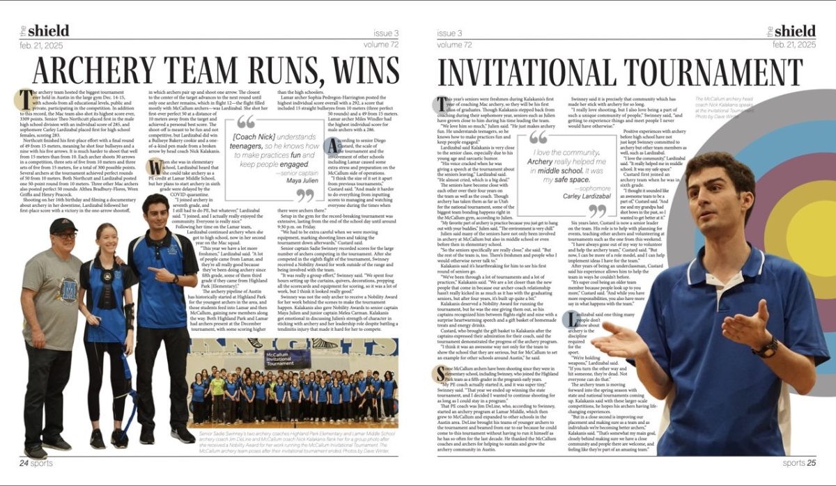
“Archery team runs, wins invitational tournament”
A three-page spread has rarely been done in one of our print newspapers but due to the size of the story and the amount of photos taken at this archery event, I knew there could be a creative way to share this story. My inspiration for the cover page were magazines like The Atlantic and Vanity Fair that utilize large graphics before a long-form story. My goal was to make the cover page bold and interesting so the reader would have no choice but to continue reading. The spread on the next two pages incorporates cutouts and graphics with the continuation of the archery bullseye. The circled letters at the beginning of some of the paragraphs separates the long story into unique sections. While the page design process was time consuming, I believe this is one of the most unique designs we’ve ever printed.
Print Issue No. 4, April 18, 2025, page 30
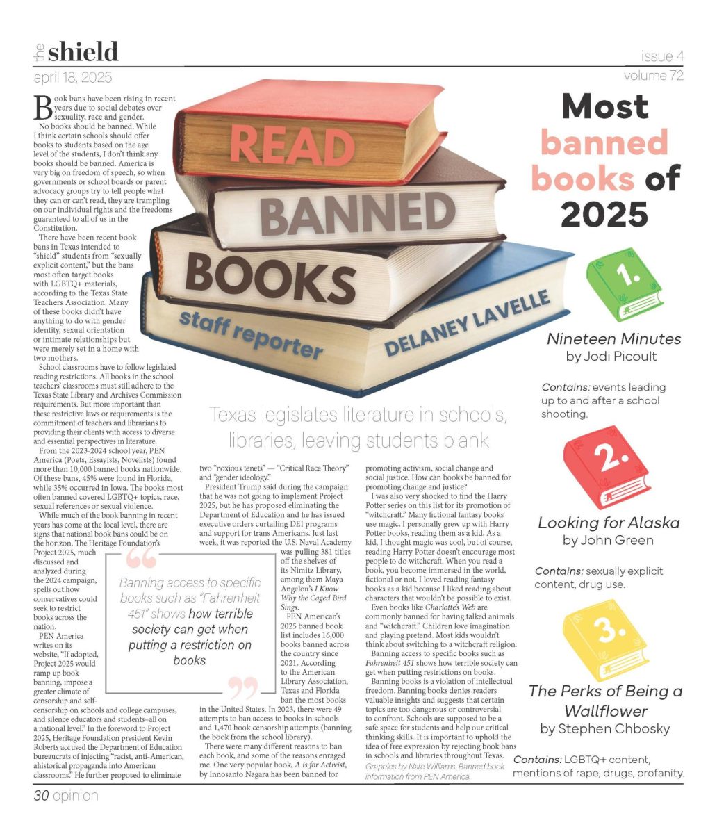
“Read banned books”
The opinion on banned books page design came at a time when I was trying to incorporate lots of unique styles into our print papers. Two main themes I was attempting to add to our pages was different headlines and infographics. Instead of a normal black and bold headline that would go across the top of the page, I created a graphic that incorporates the headline on Canva. For the sidebar, I researched what the most banned books were in the U.S. and created graphics and a content warning comment to go with the top three. I most appreciated the eye-catching quality of this page and I hoped our readers would latch on to the large main graphic and continue further reading.
Print Issue No. 4, April 18, 2025, pages 16-17
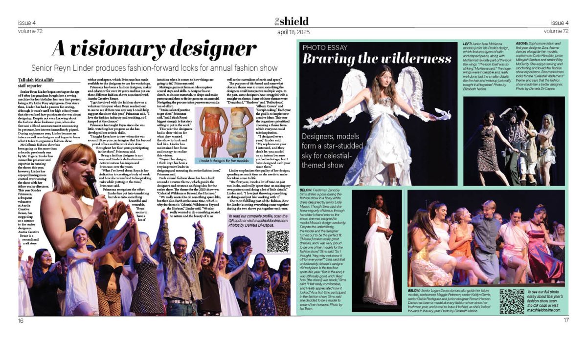
“A visionary designer”/”Braving the wilderness”
Double trucks or the two-page spread at the center of our print newspaper is where we try to make our most eye-catching designs. We look for long-form stories that have lots of ways to incorporate designs into them. The school’s annual fashion show presented a perfect way to show this off. The left half of the page was designed as a profile, highlighting one of the lead designers while the other half incorporated our online photo essay. This year we printed many photo essays, much of the time using captions written for our online Tuesday Top 10s. This double truck truly tells the story of the fashion show by having a wide look at the variety of clothing that walked the stage and then a closer look at one of the most influential students behind the scenes.
Print Issue No. 5, May 16, 2025, pages 26-27
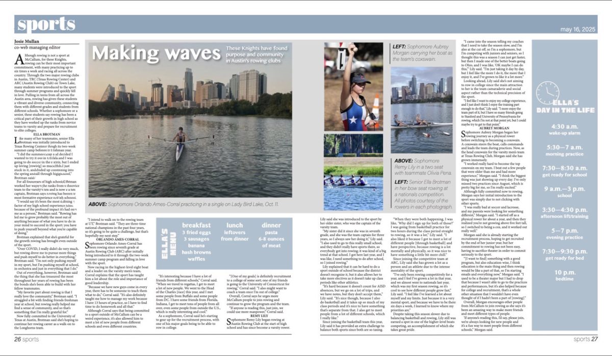
“Making waves”
One of the most unique design concepts we incorporated into our print issues this year compared to others was multi-page spreads. Due to the length and organization of the story, a two-page spread was the best way to display the storytelling. Because the story was separated into sections by athlete, it was important to make each part distinct. One of the longest and most detailed sections was with Ella Brotman. Due to this, the author followed up with her and I created a “day in the life” and “menu of the day” graphic to fill in space and tell a more complete, visual story. My goal was for the reader to get a glimpse into one of the sources life and have a more complete understanding of a rower.