
Creating has always been second nature to me. From a young age, art has been my way to process the world around me and articulate what often can’t be put into words. Over time, it has evolved from a source of joy to a means of conveying deeper themes and sparking meaningful conversations.
My art journey began at age eight in a classical studio program, where I developed both technical skills and a lasting appreciation for visual arts. That early foundation led me to pursue more intensive training at McCallum Fine Arts Academy. Being in an environment surrounded by other young artists has pushed me to expand my definition of art. While my roots were in traditional forms like drawing and painting, high school has introduced me to many forms of new media, such as printmaking, sculpture, and ceramics, that have broadened my creative language.
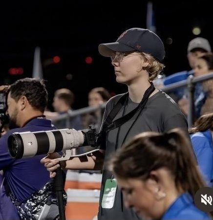
My artistic path took another turn when I joined The Shield, our school’s newspaper, during my sophomore year. I initially joined the newspaper to merge my love for writing and visual art, but quickly discovered the challenges of creating for a digital platform. I taught myself how to use Procreate and began designing graphics to accompany my stories. Soon after, I was asked to design the covers, which pushed me to think more critically about layout, color, and audience impact.
Working on The Shield has been one of the most transformative experiences in my creative development. It introduced me to the world of publication design, taught me how to adapt my artistic voice to serve a broader purpose, and gave me a collaborative community I deeply value. As the Design and Visuals Editor, I help guide the visual direction of our paper while continuing to learn from others. I’m excited by the challenge of finding new ways to make art accessible, purposeful, and resonant.
Piece 1: Voice of the Voter
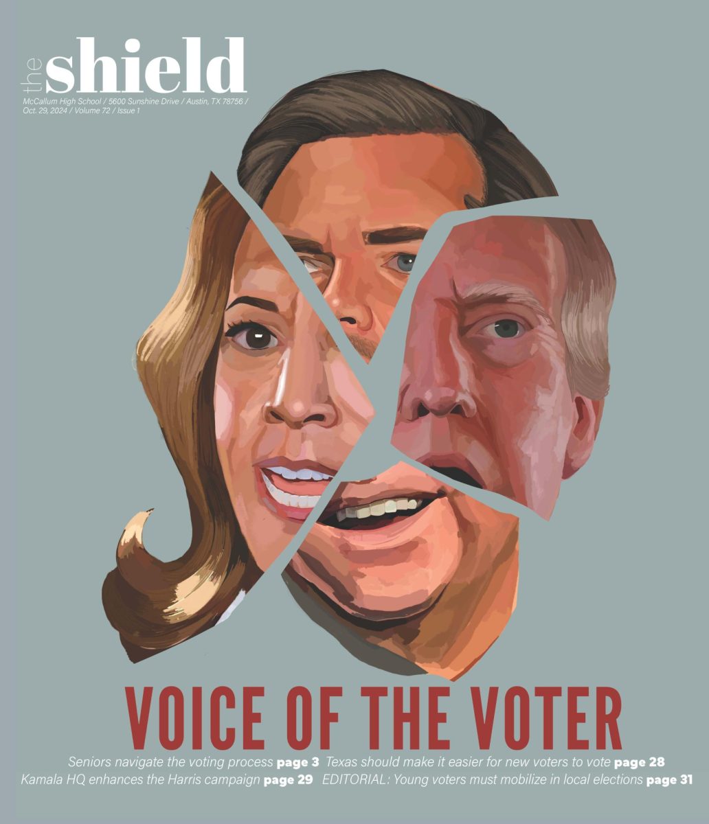
Our first issue covered the 2025 U.S. election, focusing on the importance of voting in all elections, big or small. For my cover design, I chose to depict both presidential candidates and their vice presidential running mates. I picked each candidate’s prominent features and pieced them together in a collage format to juxtapose their faces stylistically. The intensity of their expressions was meant to highlight the fever pitch of the campaign in the weeks leading up to the election. I tried to portray features and expressions such as furrowed brows and clenched jaws to show the tension between the candidates and the voters.
Piece 2: Dangers of Social Media
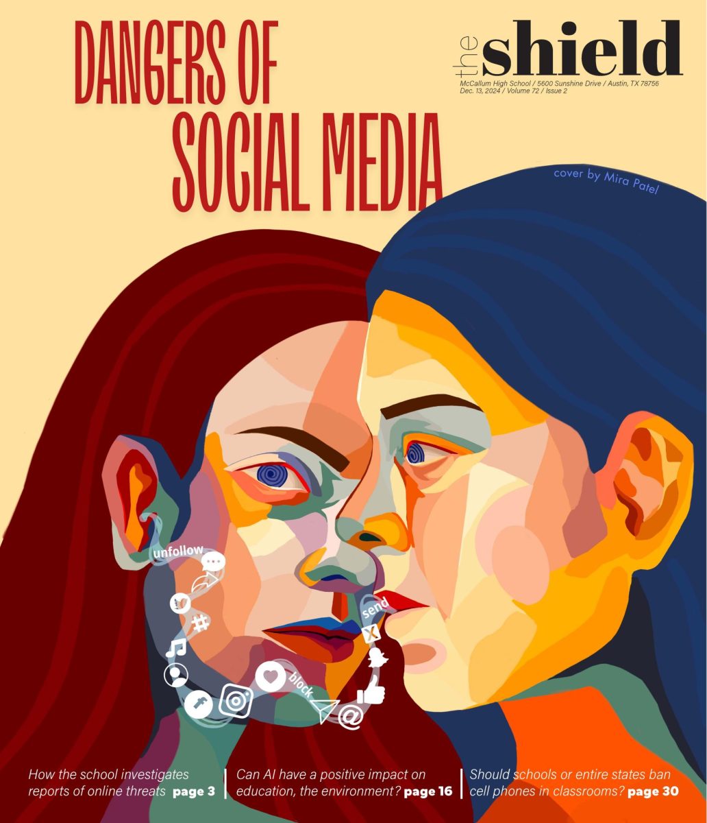
Our second issue was focused on technology and its impact on students. I wanted to depict uncertainty, fear, and a trance-like state that can result from overusing social media. For this cover, I attempted to recreate a style that I often use in my paintings, which incorporates a mosaic style. I use this style because I like the way that it allows me to focus on a theme without ascribing it to a specific person or group. I translated this mosaic style to a format suitable for print using Procreate. This was a significant design challenge for me, but I was happy with the resulting product, as I was able to bring a painterly style to the newspaper cover.
Piece 3: Winds of Change
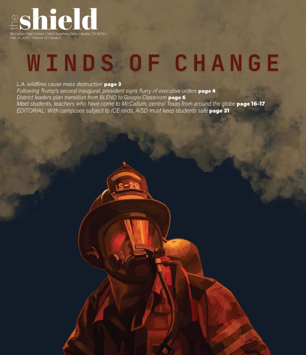
Issue three highlighted many large-scale changes that were happening nationally, including the transition in the federal government, the TikTok ban, and the Los Angeles wildfires. For this cover, I collaborated with a photographer who had captured a poignant moment of a firefighter to use as my reference photo for the cover. With the photographer’s permission, I drew the photograph using Procreate and added a dramatic background to capture the feel of smoke and emotion that was running high at the time. Through this cover, I was able to experiment with the opacity and layering on Procreate while creating the clouds of smoke, which was a new skill that I have since used to add depth to subsequent designs.
Piece 4: Whose America?
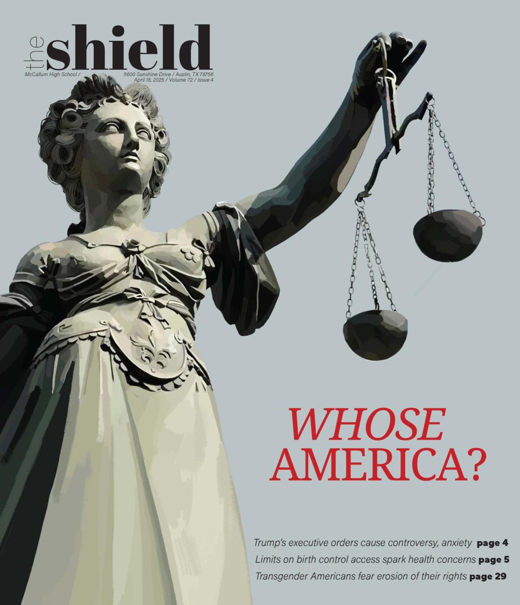
Issue four coincided with a tumultuous time in which many questions were being raised about representation and justice in America. After much brainstorming, I decided to draw Lady Justice wielding a scale to portray the balance of power that was playing out in society. The choice of font was an intentional old American newspaper font to bring to mind how power has both shifted and stayed the same. I framed Lady Justice from an upward perspective to emphasize the ideas of power. The choice of colors was also intentional in reference to the two major political parties in America.
Piece 5: A “Brat” Election
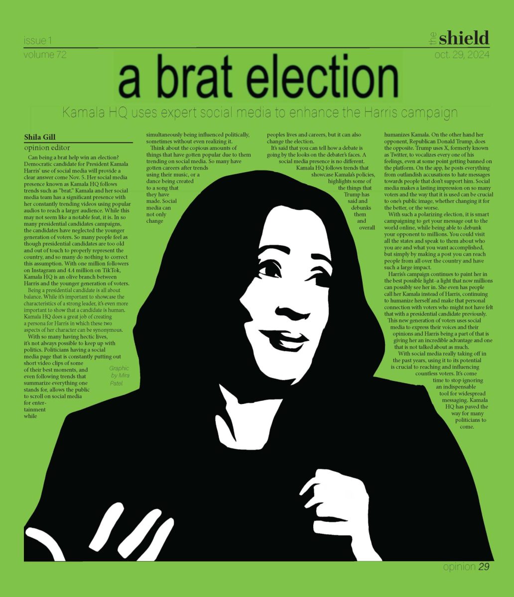
This page accompanied an Opinion article exploring how Kamala Harris’s campaign utilized social media trends and the visual language of Charli XCX’s Brat album to shape its digital presence. I illustrated Harris in a bold black-and-white silhouette, then surrounded her with vibrant neon green elements inspired by the Brat album cover. The contrast helped emphasize the interplay between traditional political imagery and contemporary pop culture aesthetics.